.jpg)
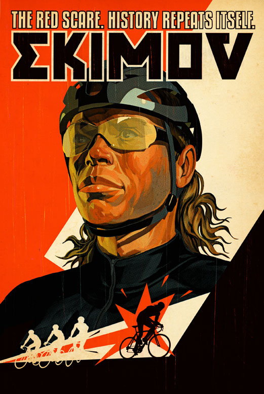
This Canadian illustrator combines 1940s comicbook art with Russian propaganda styles and old printing techniques. This wonderfull mix makes powerfull, fat illustrations that explode right of the page.
What I think is really good on these works, is that from a distance they seem simple and clear. However, if you look closer you discover a ton of details, anatomical knowledge and sweet printmaking 'accidents'. Not only is it well illustrated, also very well designed. Typography, composition and use of color fits perfectly together.
What also works, and this is something I've been thinking about more often, is how his works look like they belong together, consequently the same style, recognisable and therefore probably better marketable. You call this guy, you know what to expect. It will spread his name easier and agents can promote him efficiently to specific jobs. This is hard if you look at my work, a mixture of everything more or less. I should keep this in mind and maybe slowly form a more united body of work.
I'm not so fond of his animations found on his website. I miss the printed feel and the time you can take to look at all the details. But take a look at his portfolio if you like the ones posted here. There's a lot more and all are great.


All right! I've seen the 'Compagno Rupert' one somewhere before, but not the others, and hadn't heard of the name of the illustrator. Great, great attention to detail, colour, tone, etc... I especially like the 'Avatar' one. Great work!
ReplyDelete