.jpg)
Wednesday, April 28, 2010
Mesmerizing
The more I listen to it, I mean really listen to it, the more I come to the conclusion that this must be either the most stupid or the most brilliant theme song ever. I can't decide which.
Tuesday, April 27, 2010

Do you like manifestos?
I do!
I'm not sure why, but they have a strange appeal to me
I should really do a longer research on this phenomenon.
But for now, here's my first tip:
Bruce Mau and his manifesto for growth from the late 80ies.
It's kind of helpful for the creative process, sometimes, espiacially if you're confused and don't know where to start (anywhere, of course:).
It's kind of long, I paste here just a few lines...
1. Allow events to change you.
You have to be willing to grow. Growth is different from something that happens to you. You produce it. You live it. The prerequisites for growth: the openness to experience events and the willingness to be changed by them.
2. Forget about good.
Good is a known quantity. Good is what we all agree on. Growth is not necessarily good. Growth is an exploration of unlit recesses that may or may not yield to our research. As long as you stick to good you'll never have real growth.
4. Love your experiments (as you would an ugly child).
Joy is the engine of growth. Exploit the liberty in casting your work as beautiful experiments, iterations, attempts, trials, and errors. Take the long view and allow yourself the fun of failure every day.
6. Capture accidents.
The wrong answer is the right answer in search of a different question. Collect wrong answers as part of the process. Ask different questions.
8. Drift.
Allow yourself to wander aimlessly. Explore adjacencies. Lack judgment. Postpone criticism.
9. Begin anywhere.
John Cage tells us that not knowing where to begin is a common form of paralysis. His advice: begin anywhere.
13. Slow down.
Desynchronize from standard time frames and surprising opportunities may present themselves.
14. Don’t be cool.
Cool is conservative fear dressed in black. Free yourself from limits of this sort.
16. Collaborate.
The space between people working together is filled with conflict, friction, strife, exhilaration, delight, and vast creative potential.
18. Stay up late.
Strange things happen when you’ve gone too far, been up too long, worked too hard, and you're separated from the rest of the world.
21. Repeat yourself.
If you like it, do it again. If you don’t like it, do it again.
22. Make your own tools.
Hybridize your tools in order to build unique things. Even simple tools that are your own can yield entirely new avenues of exploration. Remember, tools amplify our capacities, so even a small tool can make a big difference.
23. Stand on someone’s shoulders.
You can travel farther carried on the accomplishments of those who came before you. And the view is so much better.
24. Avoid software.
The problem with software is that everyone has it.
27. Read only left-hand pages.
Marshall McLuhan did this. By decreasing the amount of information, we leave room for what he called our "noodle."
34. Make mistakes faster.
This isn’t my idea – I borrowed it. I think it belongs to Andy Grove
35. Imitate.
Don’t be shy about it. Try to get as close as you can. You'll never get all the way, and the separation might be truly remarkable. We have only to look to Richard Hamilton and his version of Marcel Duchamp’s large glass to see how rich, discredited, and underused imitation is as a technique.
39. Coffee breaks, cab rides, green rooms.
Real growth often happens outside of where we intend it to, in the interstitial spaces – what Dr. Seuss calls "the waiting place." Hans Ulrich Obrist once organized a science and art conference with all of the infrastructure of a conference – the parties, chats, lunches, airport arrivals – but with no actual conference. Apparently it was hugely successful and spawned many ongoing collaborations.
42. Remember.
Growth is only possible as a product of history. Without memory, innovation is merely novelty. History gives growth a direction. But a memory is never perfect. Every memory is a degraded or composite image of a previous moment or event. That’s what makes us aware of its quality as a past and not a present. It means that every memory is new, a partial construct different from its source, and, as such, a potential for growth itself.
Farbattacke!
Check out what happened at Rosentalerplatz yesterday! Is it art or is it fun? Or both? Streetart maybe. There is a film too. What a colorfull mess!


Sunday, April 25, 2010
Stickin' it to the man
Artists throughout the ages have always struggled with the dilemma of having to rely on commissioners or benefactors to be able to work with their art or craft. Often there are no conflicts in these situations, but many times artists get commissioned to do work that in one way or other goes against their values, beliefs or morals. Of course, the artist always has the choice of turning down a job, even if it would mean financial hardship. But, alas, there are other ways of dealing with the situation. Some artist/craftsmen are brave enough to accept the commission, and then use it as a way of making a statement at the risk of enraging the commissioner. Two examples come to mind.
Johnny Hardstaff is a creative English designer, illustrator, director, animator and whatnot. Although primarily making a living from advertisement these days, he is also constantly developing his own personal, artistic projects on the side, and in a lecture at the Tate Modern in London, he clearly and strongly expressed his own contempt and guilt for the way he's making a living from helping big corporations trick people into buying stuff.
When approached by Sony in 2001 to make an experimental film on the theme of the Playstation 2, no strings attached, he jumped at the chance. Sony was of course expecting an edgy, cool film they could use in promoting the Playstation console, but when presented with the result, I'm guessing they regretted giving Hardstaff free reign. The film was never used in Sony's ad campaign, but you can enjoy it here:
Similarly, my favourite comic book artist and illustrator Chris Ware was recently commissioned to draw a cover for an upcoming issue of Fortune, the global business magazine of choice for hungry capitalists on the money-tumour bandwagon (i.e. accumulating wealth for the sake of accumulating wealth).
Click to enlarge the illustration and see the various ways Ware attacks America's corporations and government, referencing various aspects like the recession, flooded homes, and Guantánamo Bay. The cover was rejected.
Saturday, April 24, 2010
Text & Image II
You always can push the borders further....
Some book-artwork by Brian Dettmer, who not just overdraw or -paint the text as tom Phillips in the humument, but even more, cuts away stuff, creating new connections this way, or maybe it's meant to be more like an easthetique sculpture, without any "deeper meaning"?
Anyway, very nice artwork, just becoming a little redundant (unfortunately) after a while.
But maybe that's the curse of the art market: once you're creating something great and innovative, the market wants more and more of this...


Friday, April 23, 2010
Neo Rauch 50

German painter and frontman of the so called 'Neue Leipziger Schule' has turned 50. This is celebrated with two exhibitions, in Munich and Leipzig. Mr. Rauch is a big star. Brad Pitt payed a million dollars for one of his paintings, he drives a porsche and has a boxing punch bag in his studio. Still, he refuses all offers he gets to move to New York where artist can be like rockstars, something I don't think is possible in Germany. His choice to stay in his old factory in Leipzig and focus on painting 15 to 20 paintings a year shows dedication and hard work. Being a rockstar is not his thing. Leave that to the gallerist. Mr Lybke from gallery Eigen+Art in Auguststraße is the extravagant art dealer that created the myth around contemporary art coming from behind the iron curtain, shielded from the influence of Joseph Beuys, where craft is added to modern elements. Lybke created a hype, mostly among American collectors and prices went skyhigh. They love this DDR mistique in the states, but in Germany some grumpy critics have filed Rauch's art as a 'Wendeproduct' His work has been called 'kitsch', and 'without feeling' by ZDF. Der Spiegel on the contrary is very charmed of him and enjoys the retrospectives we can see now. So like all things that stick out one way or another, opinions are divided and that's how it should be. I like the works very much, from a technical point of view as an illustrator, but moreso the dreamy underbelly feelings they rise. It has some well painted figurative elements to hold on to and leaves you free to go anywhere from there. I like that.
 I also like the fact that Neo Rauch is a worker. He does not like to talk about his work, refuses to explain it and leaves all business to the gallerist. Who makes sure all works are sold like fresh buns from the bakery. This means we can't really see the vast majority of his work since they are kept at mr. Pitt's mansion. Therefore I am looking forward to going down to Leipzig and see a bunch of giant paintings that are without a doubt going to make me want to paint more. Who's coming with me?!
Thursday, April 22, 2010
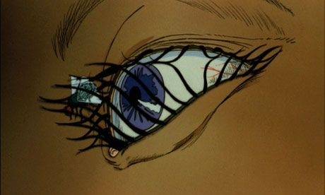
Soviet Sci-Fi Animation in the 1980's
I can't think of anyone here who wouldn't enjoy these. Six online cartoons here.
Aeon Flux and the Genius of Peter Chung (part 1)
One of my favourite things in the world is when low-brow (or "pop culture") marries high-brow and becomes something new. Examples of this would be Twin Peaks, combining one of the lowest form of drama -- the soap opera -- with the avant garde surrealism of David Lynch; another example is Chris Ware, who with his refined, almost pictographical compositions combined with his explorations of human psychology and emotional torment, has taken the comic book medium to supreme artistic heights.
However, one of my favourite examples of low-brow gone avant-garde has to be Peter Chung's "Aeon Flux", an animated series commissioned by MTV in the early nineties, back when MTV actually was an exciting, progressive and somewhat subversive force, initiating innovative projects and funding experimental works by the likes of Jan Svankmajer and the Brothers Quay. (Don't get me started on what a stupid, capitalistic shithole of a mainstream tv station MTV has become since then.)

On the surface, Aeon Flux might look somewhat like your normal, conventional sci-fi action cartoon, but that's where the similarities end. Beneath the surface lies an intricate web of narrative complexity, poetic ambiguity, morbidity, abstraction, moral philosophy and sexual perversion, making this a decidedly adult oriented cartoon.
In the beginning, the episodes were short and completely without dialogue -- more like 'visual poems' than any kind of traditional narrative. Later the series evolved into 30-minute episodes with dialogue, but still retaining the poetic and abstract aspects of its narrative -- often starting episodes "in medias res" without any real exposition or clear objective, leaving the viewer with a great deal of mystery and ambiguity.
I will write more about Aeon Flux in future posts, but for now I leave you with one of the early episodes, "Leisure", a clip I believe serves as a good introduction to the themes and aesthetics of the series. (Sorry about the poor quality, and please turn the volume quite low before playing.)
However, one of my favourite examples of low-brow gone avant-garde has to be Peter Chung's "Aeon Flux", an animated series commissioned by MTV in the early nineties, back when MTV actually was an exciting, progressive and somewhat subversive force, initiating innovative projects and funding experimental works by the likes of Jan Svankmajer and the Brothers Quay. (Don't get me started on what a stupid, capitalistic shithole of a mainstream tv station MTV has become since then.)
On the surface, Aeon Flux might look somewhat like your normal, conventional sci-fi action cartoon, but that's where the similarities end. Beneath the surface lies an intricate web of narrative complexity, poetic ambiguity, morbidity, abstraction, moral philosophy and sexual perversion, making this a decidedly adult oriented cartoon.
In the beginning, the episodes were short and completely without dialogue -- more like 'visual poems' than any kind of traditional narrative. Later the series evolved into 30-minute episodes with dialogue, but still retaining the poetic and abstract aspects of its narrative -- often starting episodes "in medias res" without any real exposition or clear objective, leaving the viewer with a great deal of mystery and ambiguity.
I will write more about Aeon Flux in future posts, but for now I leave you with one of the early episodes, "Leisure", a clip I believe serves as a good introduction to the themes and aesthetics of the series. (Sorry about the poor quality, and please turn the volume quite low before playing.)
The Ghost Song by Salty Holmes
Start the day with a nice song full of atmosphere! Salty was not only a country singer, but a B-movie actor as well. I guess that's where he learned how to make those crazy faces. I wish I could get it on cd, but this clip it seems to be the only registration of the song.
Wednesday, April 21, 2010
Frankenstein addition
In this clip Bernie has some interesting contemplations on the movie, Mary Shelly's book, boris Karloff's performance and illustrating the book. While making a sweet drawing!
Text and image
.jpg) In reaction to Jenny's interesting post, I'd like to add some thoughts on Doré's and Phillips' illustration solutions. In my opinion, the best illustration is one that adds to the text, not only depicts parts of it. If the illustration fails to have a catchy concept, you better make sure it looks amazing, in other words; if you haven't got a great idea, compensate with technical skill. If both are in the mix you hit the jackpot.
In reaction to Jenny's interesting post, I'd like to add some thoughts on Doré's and Phillips' illustration solutions. In my opinion, the best illustration is one that adds to the text, not only depicts parts of it. If the illustration fails to have a catchy concept, you better make sure it looks amazing, in other words; if you haven't got a great idea, compensate with technical skill. If both are in the mix you hit the jackpot.Tom Phillips take on Dante's poem demands a lot of participation from the viewer and therefore might be more interesting from the artistic perspective. It is like comparing a Hollywood production to a Lars von Trier film.
In Doré's case, I think he overpowered the original poem. As jenny said, no need to read no more! This would be a sad thing for the writer if this was a new story being told, but this thing was written about 550 years before Doré took his turn on it. It was going to be his party!


A contemporary example of this is the take on Frankenstein by Bernie Wrightson. Everybody more or less knows the story, so he goes crazy on the drawings. Clearly inspired by the engravings of Doré, he depicts the classic story in pen and ink, not being too conceptual, but visually overwhelming. Wonderfull eyecandy. If this would have been made before the film he would without a doubt have set the visual standard on this classic tale. Bernie Wrightson's Frankenstein may be an iconic book, the visual standard had already been set by Boris Karloff in the 30s. His monster is the true icon.

A tv Dante
In addition to my last post:
There's also a Dante tv-series by Tom Phillips and Peter Greeneway containing the first 8 Chants of the Inferno.
See the whole series at ubuweb.
There's also a Dante tv-series by Tom Phillips and Peter Greeneway containing the first 8 Chants of the Inferno.
See the whole series at ubuweb.
Tuesday, April 20, 2010
Tom Phillips' Dante
A couple of weeks ago, I stumbled upon a very interesting bunch of illustrations in a book about dante's divine comedy showing an overview of 6 centuries of published illustrations.
Most of them are more or less representing a classical illustration style.
You get an (often) very detailed view of heaven and hell as described within the text, you'll find angles in heaven, firegraves, devils and other monsters in hell and a lot of torture of course.
Gustave Dorés visions are a kind of good example of that style. You can really imagine all the things happening in the book, but actually, do you really need the text then, after all?

I always saw this problem of redundancy in classical book illustrations and often wonder how to deal in a more conceptual way with that. In the case of the divine comedy it's even worse since the text itself is quite illustrative and actually doesn't need any illustration aside.
In contrast to that, the work of Tom Phillips shows in a wonderful way how this problem can be solved, how you can do illustrations, giving the text a totally new perspective, drawing analogies to far away subjects and open up a new horizon.

This illustration deals with the moment, when Beatrice's soul (shown here in form of a butterfly) descends to help Dante and send him to his journey through heven and hell at the very beginning of the divine comedy. The text aside is not taken from the book itself, but from another novel, that he used as well for another work, "humument" , creating a new book by overdrawing this found novel "A human nature".

Ass-Crack Stage-Hack
The wonderful, beautiful poster for my Holland gig with Greg Haines has arrived! Designed by the ever-fantastic Bas Mantel.

Monday, April 19, 2010

Sunday, April 18, 2010
Bernard Herrmann and Brian De Palma's "Sisters" (1973)
The other week I had the pleasure of watching Brian De Palma's 1973 horror-thriller "Sisters", a film I've been dying to see for a long time, it being one of the last films that the legendary film composer Bernard Herrmann worked on. Herrmann had an amazing career in film composing, spanning from his very first score -- Orson Welles' "Citizen Kane" (1941) -- to his very last -- Martin Scorcese's "Taxi Driver" (1975).
My introduction to Herrmann's work came totally by chance when I was maybe eight or nine years old. Being a child of the 1980's, my musical tastes were confined to the likes of A-Ha, Alphaville and Bon Jovi, but I can remember clearly walking past my father's study one day and having my mind blown by a musical epiphany; my father was not in the room at the moment, but he had his radio turned on, and from its speakers flowed this amazingly enigmatic, mesmerizing and thrilling piece that made me stop dead in my tracks and just listen.
As the piece ended, the announcer informed me that it was the title music from Hitchcock's "Psycho" (1960). I never forgot that, even though it would be several years before I actually would see the film. Herrmann's amazing score for "Psycho" is of course best known for those shrieking, stabbing violin notes in the shower scene, but the Bartòk-esque title music that I heard on the radio as a child is simply an amazing piece of music and just as exciting to me today:
As I grew more interested in film music over the years, I discovered other key works in Herrmann's oeuvre, such as the scores to Vertigo (1958) and The Day the Earth Stood Still (1951 - probably the first time a theremin was used in a Hollywood movie). Herrmann was without a doubt one of my key influences as a teenager, along with Danny Elfman (who, honestly, based a lot of his own music on Herrmann's style), before I put my film music ambitions aside in favour of more experimental waters.
As for "Sisters", it's a delightful 1970's horror-thriller containing everything you might expect from the period; beautiful afro hairstyles, split-screen sequences, and fake blood that looks like housepaint. There's no denying De Palma's Hitchcock influences -- there are clear traces back to both Psycho and Rear Window (1954), although this film probably has more 'morbid' aspects than an orthodox Hitchcock movie would allow. Another exciting bonus is the amazing character actor William Finley, who I recognized as the title character from the highly enjoyable "Phantom of the Paradise" (1974), De Palma's next film after "Sisters".
The score for "Sisters" is unmistakingly Herrmann through and through, although at times unusually 'psychedelic' for Herrmann -- for instance, I don't think I've ever heard as many synthesizers in a Herrmann score before. Of course, to me, there's no getting around the fact that the trimmed down string orchestra score for Psycho is and will always be Herrmann's great masterpiece. In any case, I recommend the film to any fan of Herrmann's work and in particular to anyone who appreciates the refined flavours of 1970's horror. Watch the trailer below, and enjoy!
Subscribe to:
Posts (Atom)